KOOKIEZ
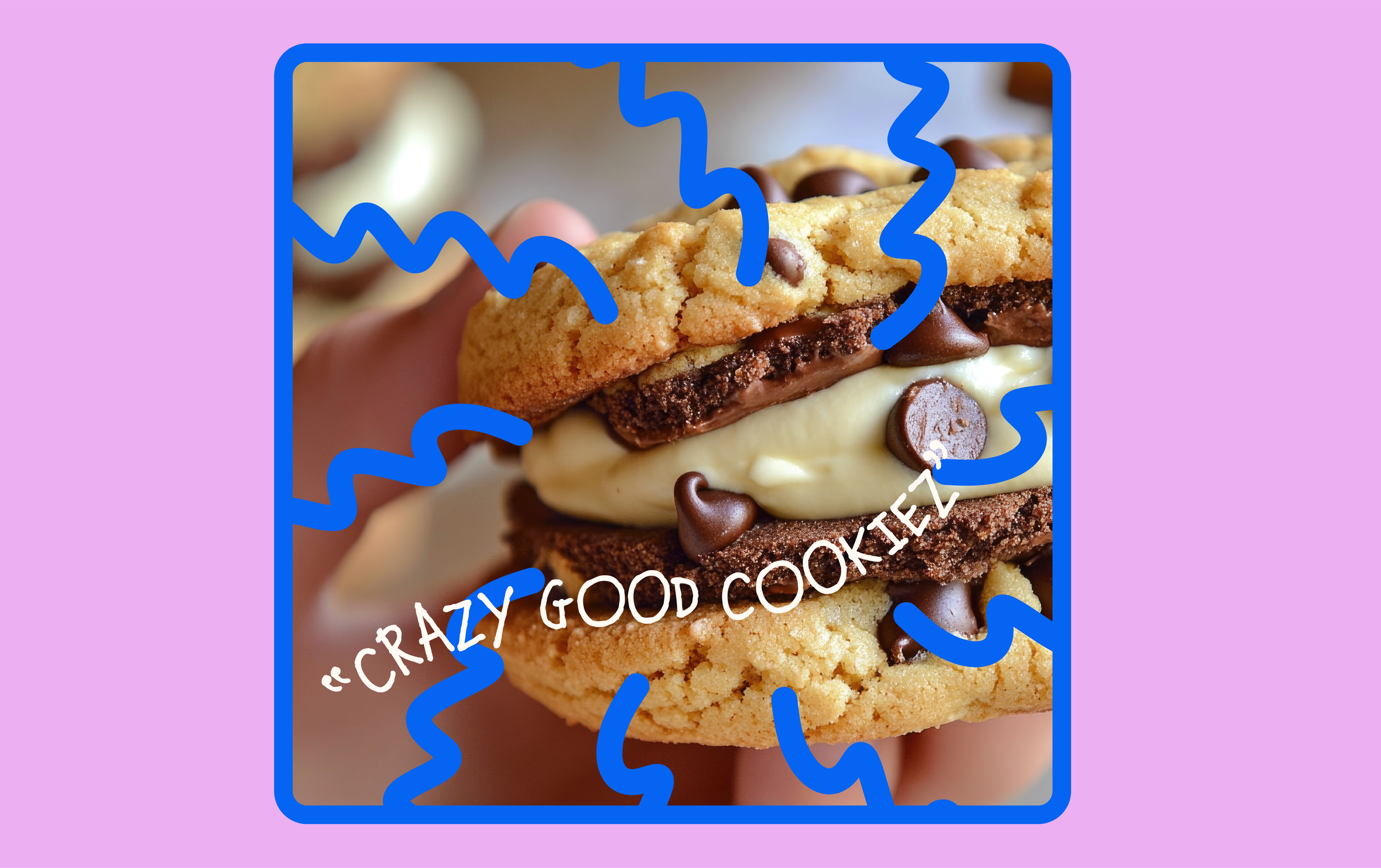
“CRAZY GOOD
COOKIEZ”
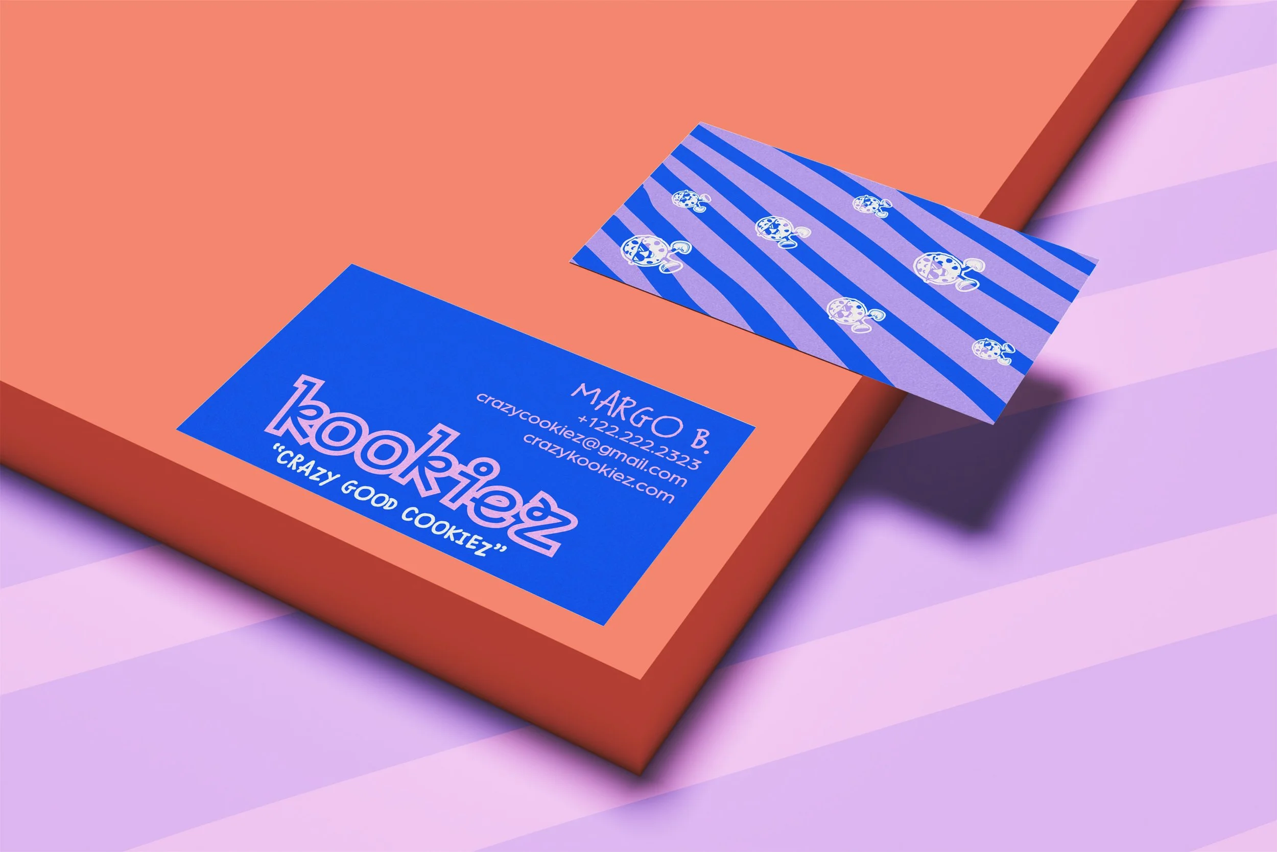
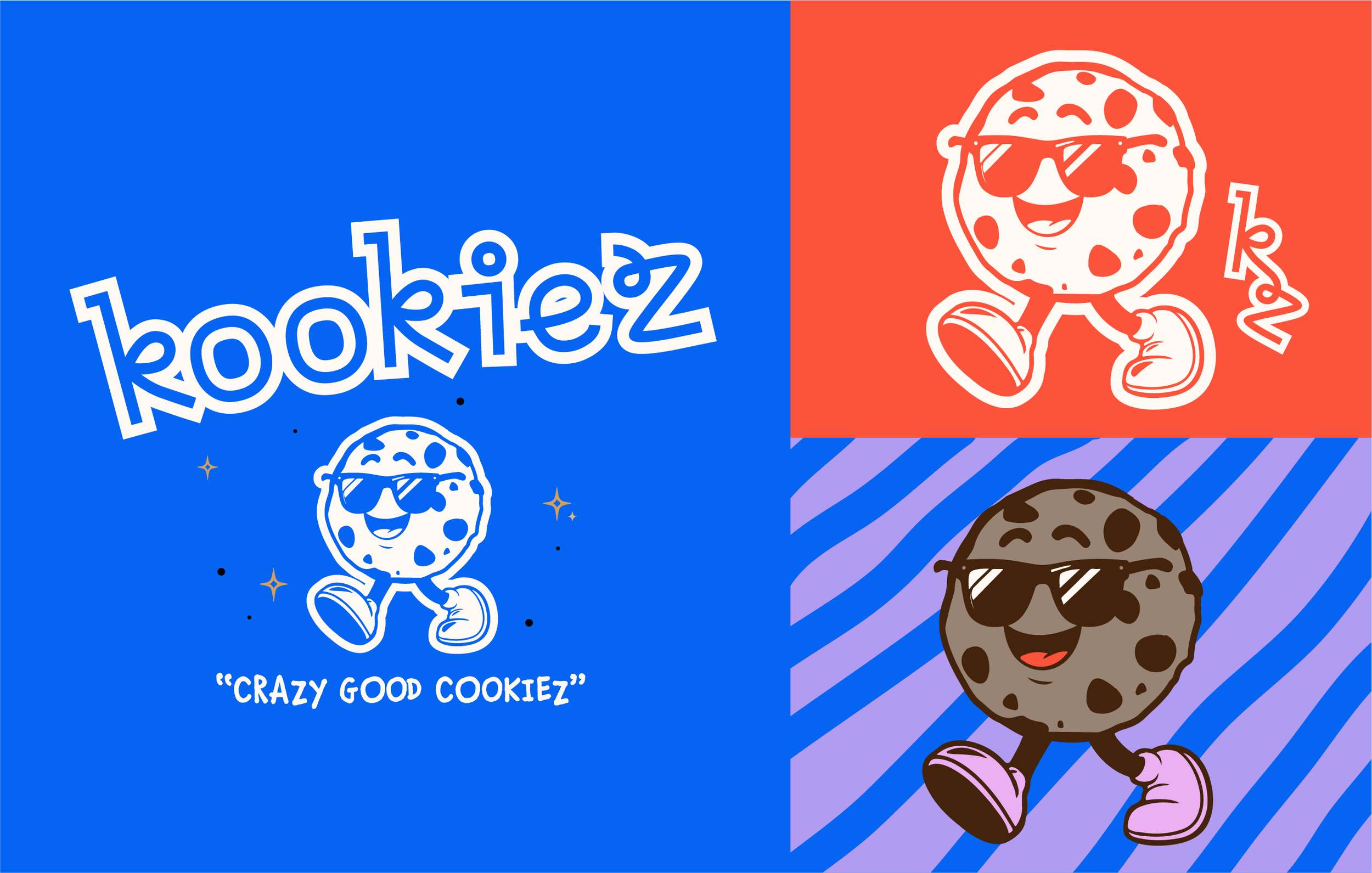
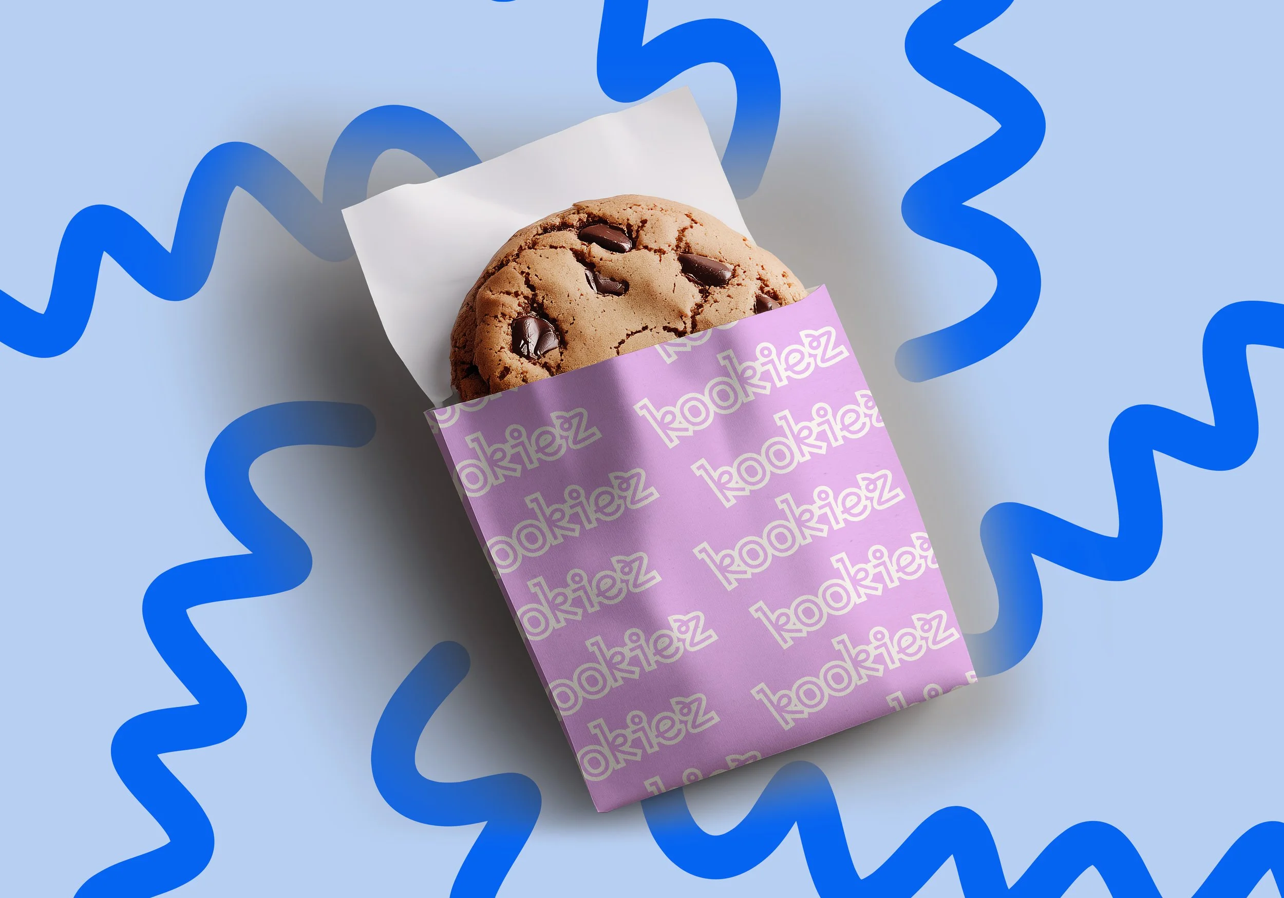
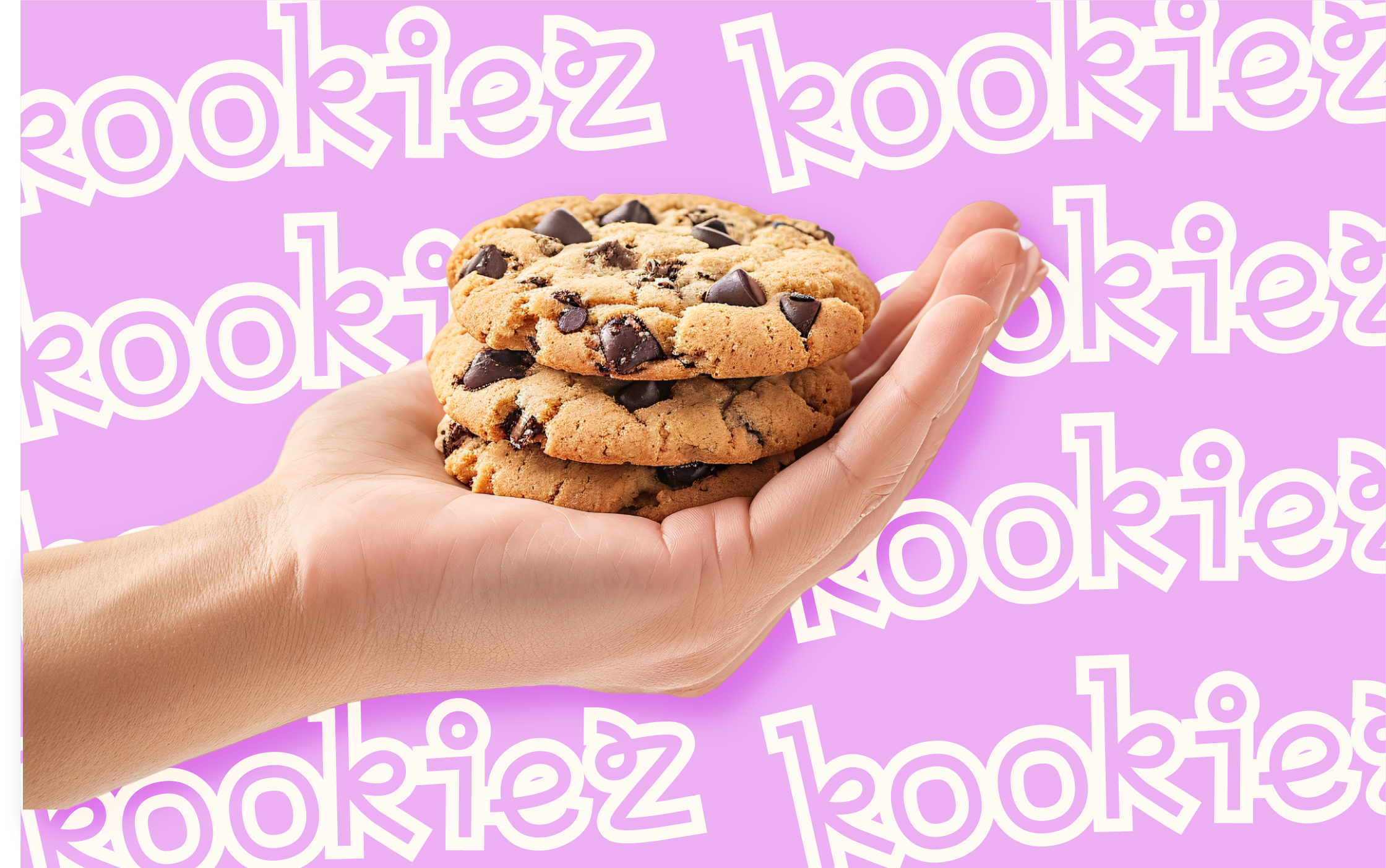
I leaned into the emotional shorthand of nostalgia and indulgence to make the brand instantly relatable: warm, rounded shapes and a candy-hued palette trigger comfort and excitement the moment you see them. The chunky, hand-drawn type feels human and approachable, mirroring the handmade quality of the cookies, while bold color contrasts create a mouthwatering visual rhythm that guides the eye across packaging and signage.
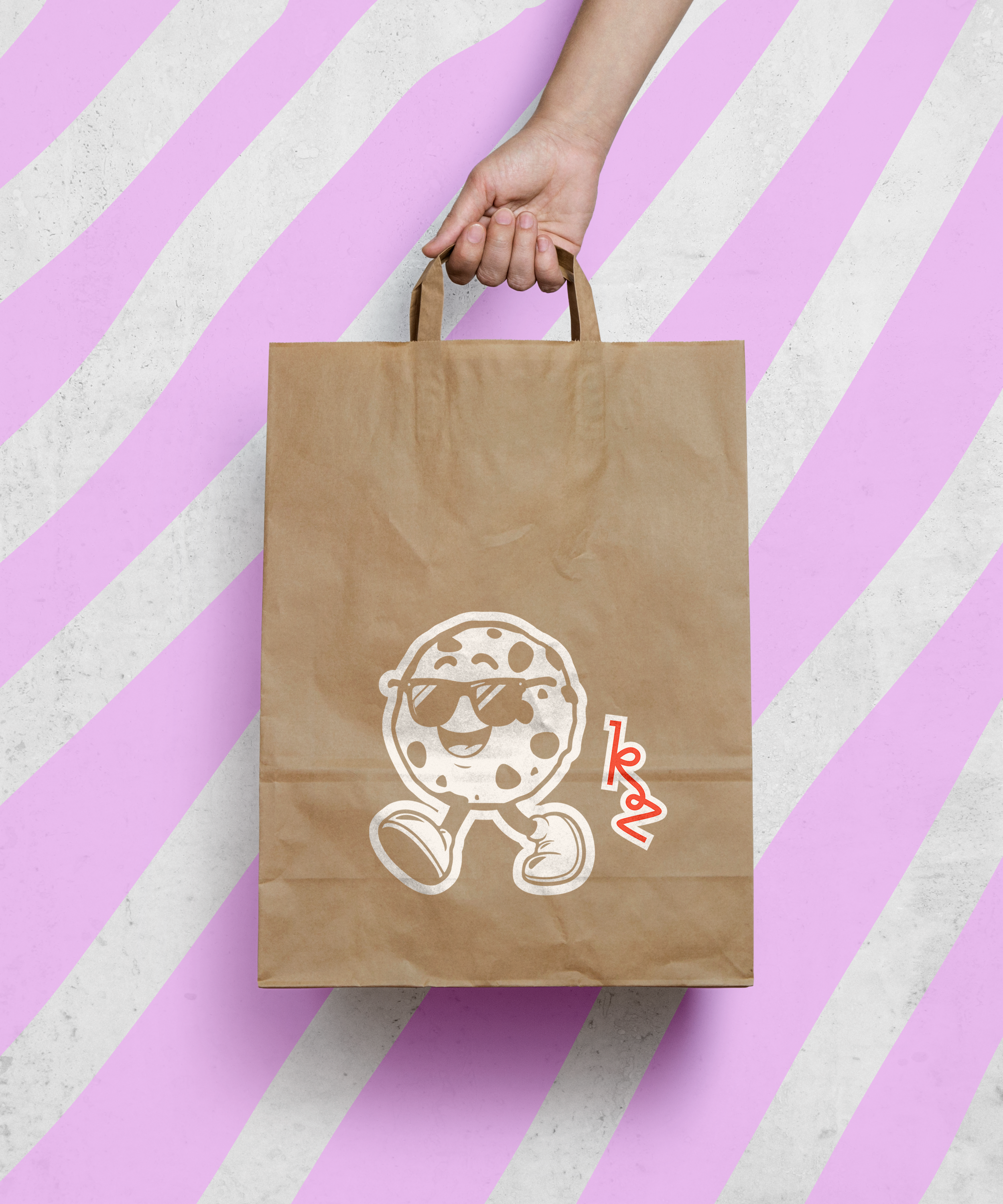
Material choices and tactile details were chosen to extend that sensory promise. Embossed logos, sprinkle-patterned wraps, and warm kraft stock provide a layered, touch-first experience that reads as premium but playful—encouraging customers to pick up, unwrap, and share. Consistent flavor-forward imagery and witty microcopy keep the tone unified across menus, merch, and social, so every interaction reinforces the core idea: Kookiez is fun, fresh, and utterly delicious.