salty

suds

In a world full of options, branding for Salty Suds captures nature and relaxation. Our playful yet calming style shows the purity of our natural bath products and encourages customers to enjoy a touch of luxury. With a serene pastel color palette, fun designs, and natural textures, Salty Suds stands out in the wellness market, inviting customers to experience refreshing scents and nourishing ingredients that care for both body and soul.
A pink background with the words 'eat tired' in large, light blue cursive text and smaller black text below that reads 'Bath + Body Products'.
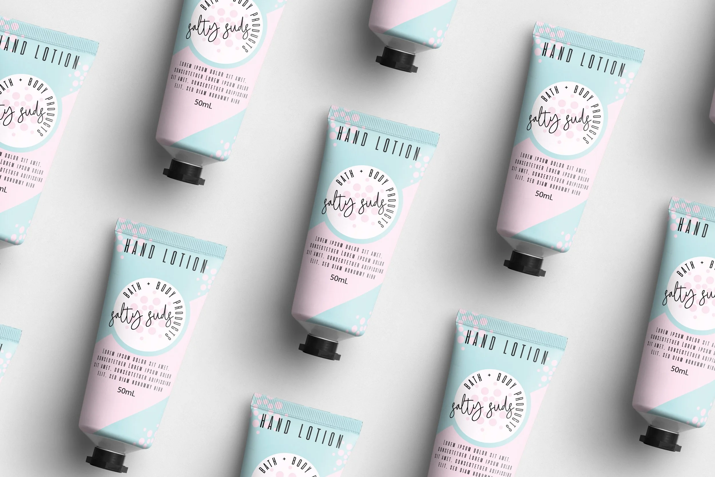
Multiple tubes of Salties Suds hand lotion with pastel pink, blue, and white packaging scattered on a light gray background.
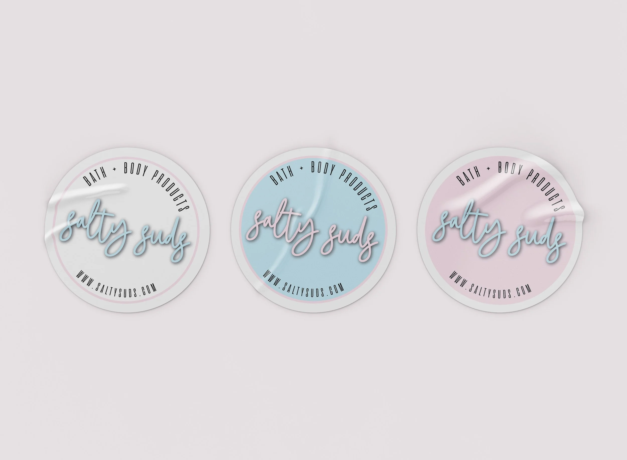
Three circular labels with a pastel-colored background, featuring the words "salty suds" in cursive font, and the website 'www.saltysuds.com' at the bottom.
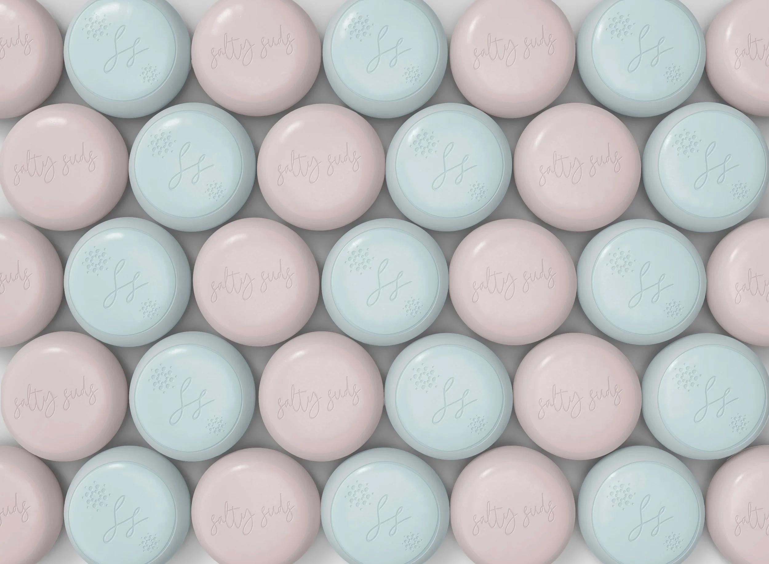
A pattern of round soap bars in pastel colors of pink and light blue, each embossed with the words 'salty sage' in cursive and a small decorative design.
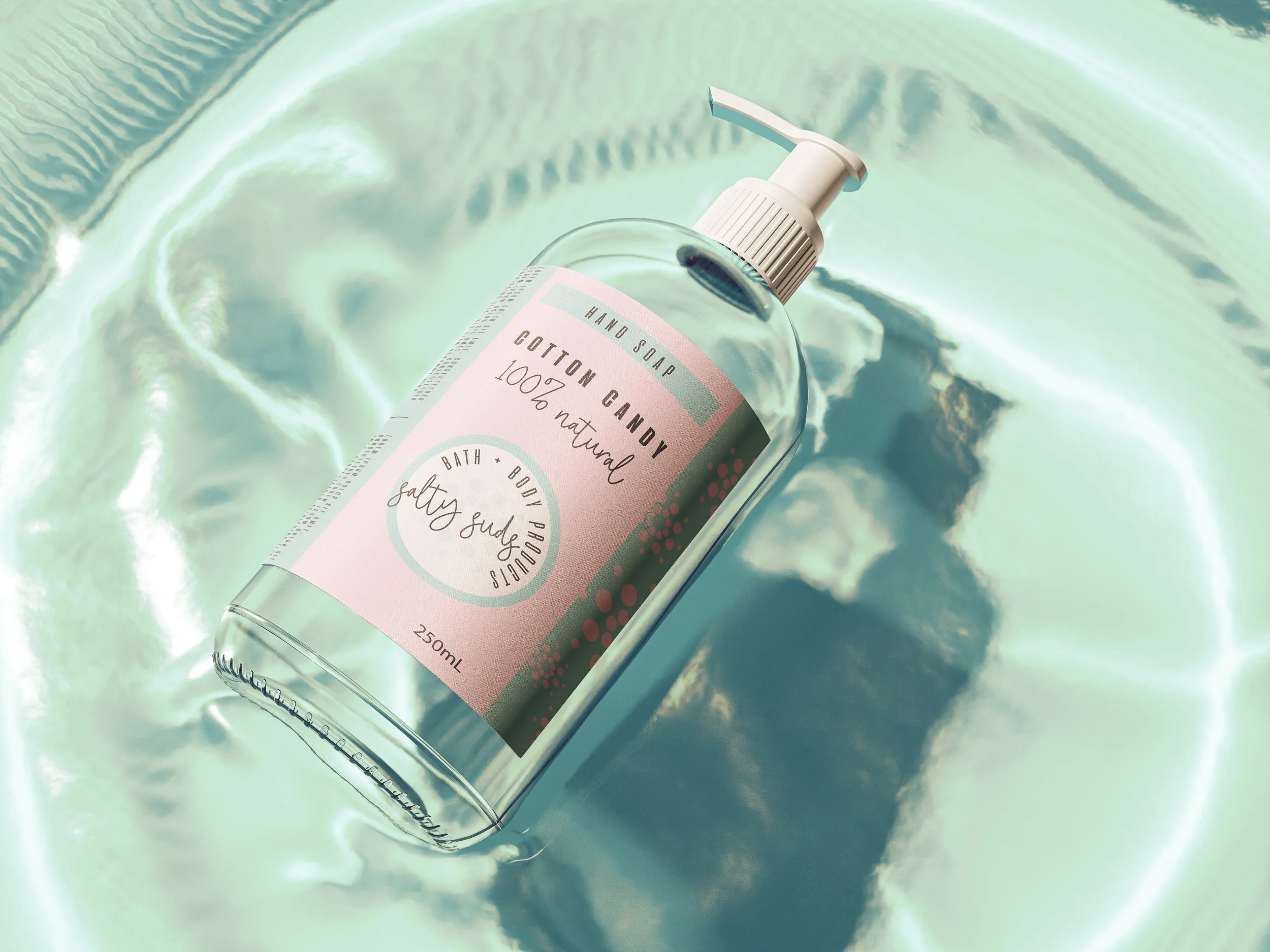
A clear plastic bottle of hand soap labeled 'Cotton Candy' with a white pump, placed on a reflective surface with a pastel-colored background.
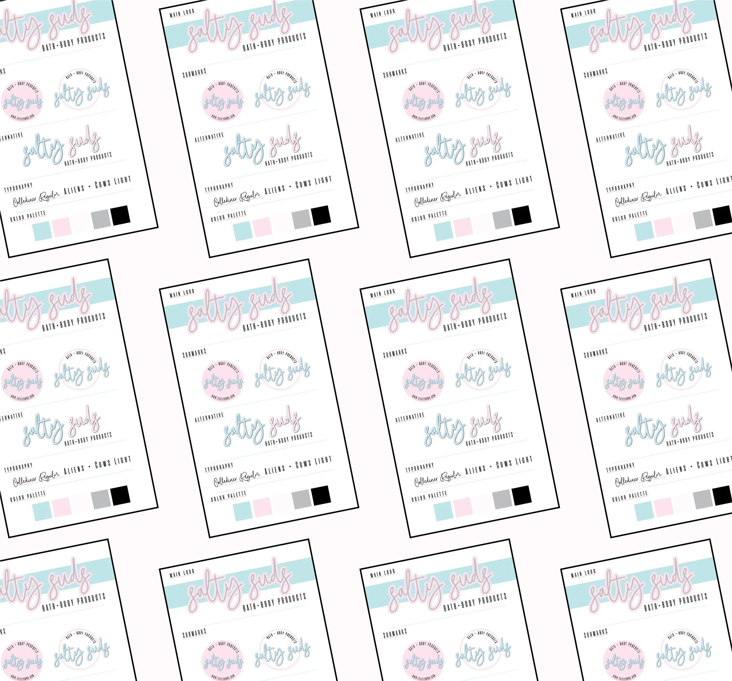
A pattern of repeated product labels for salty girl bath and body products, featuring pastel colors of pink, blue, gray, and black, with a pink and blue logo and handwritten style text.
PREVIOUS
NEXT
Pattern with pink and blue blocks featuring the text 'Salty Suds' and 'Bath & Body Products' in decorative script.